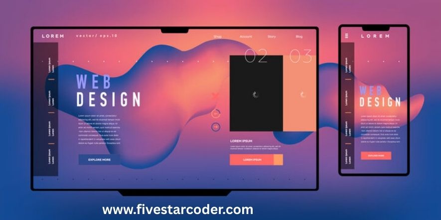
In today’s digital world, Web Design is more than just making a site look pretty—it’s about building websites that are simple to use, quick to load, and welcoming for every visitor. That’s where Responsive Web Design comes in.
A responsive website automatically adjusts its layout, images, and text to fit any screen size—whether it’s a smartphone, tablet, laptop, or wide desktop monitor. This makes browsing smoother, improves user satisfaction, and helps businesses perform better online.
With most people now browsing on mobile devices, responsive design is a must-have for brands that want to grow, build trust, and rank higher in Google search results. In this blog, we’ll explore why responsive design matters and how it can transform your website experience.
Table of Contents
What Is Web Design?
Web Design means making websites look good and work well. It covers how a page looks, the colors, the pictures, and how easily people can find things.
When we add Responsive Web Design, we make sure websites change to fit any device—phones, tablets, laptops, or big computers.
What Is Responsive Web Design?
Responsive Web Design (RWD) is a way of making websites that change to fit different screens. It uses flexible boxes, images that shrink or grow, and special rules called media queries WikipediaMDN Web Docs.
In Simple Words:
- Website boxes move around or resize.
- Pictures change size to fit.
- Rules tell the site what to do on small or big screens.
Why Does Responsive Web Design Matter?
Here’s why RWD is important:
| Problem Without RWD | What Happens | RWD Solves |
|---|---|---|
| Too small text or buttons on phones | Hard to read or tap | RWD scales text and taps |
| Pictures stick out of boxes | Looks messy | RWD resizes images |
| Pinch-zooming needed | Annoying to users | RWD fits everything nicely |
| Slow site on phones | People leave fast | RWD loads smart and fast |
RWD makes websites easier and fun to use, no matter the device BrowserStackTechRadar. It also helps your site rank better in Google because mobile-friendly sites get a boost WikipediaWIRED.
How Does Responsive Web Design Work?
Responsive Web Design uses smart techniques in Web Design to make sure a website adjusts itself to fit any screen. Instead of building different sites for phones, tablets, and desktops, you use a set of tools and rules that allow one design to work everywhere.
Here are the main tools Responsive Web Design uses:
1. Fluid Grids
Instead of fixed sizes (like 500px), designers use percentages. This way, the layout grows or shrinks depending on the device size. A box might take 50% of the screen on a desktop but 100% on a phone.
2. Flexible Images
Images scale with their containers so they don’t stretch beyond the screen. In Responsive Web Design, this keeps photos looking sharp and balanced whether they’re on a big laptop monitor or a small smartphone.
3. Media Queries
These are CSS rules that detect the width of the screen. They allow you to change the website style for different devices. For example, text can be bigger on phones or columns can stack neatly on smaller screens.
@media (max-width: 768px) {
  body { font-size: 16px; }
  .column { width: 100%; }
}
4. Viewport Meta Tag
This tells browsers how to scale and display the website. Without it, a site might look zoomed-out on phones. Adding this simple line of code in the <head> ensures the design adapts well:
<meta name="viewport" content="width=device-width, initial-scale=1.0">
5. Modern Layout Tools (Flexbox & Grid)
Web Design has evolved with Flexbox and CSS Grid. These make it easier to align and arrange elements that can resize automatically. For example, Grid lets you build complex layouts that adapt without breaking.
6. Scalable Typography
Fonts also adjust in Responsive Web Design. Designers often use relative units like em or rem instead of fixed pixels. This ensures text stays readable on every device.
7. Responsive Navigation
Menus that look fine on desktops can become hard to use on mobiles. Responsive navigation uses techniques like “hamburger menus” or collapsible sidebars to keep navigation easy and user-friendly.
8. Mobile-First Approach
In modern Web Design, many developers build websites starting from the smallest screen (mobile) and then scale up. This ensures the most important features work well on phones, where most visitors are.
9. Performance Optimization
Responsive websites often include lazy loading for images, compressed files, and fast-loading code. This is vital because mobile users expect pages to load quickly, even on slower connections.
10. Responsive Testing Tools
Developers test Responsive Web Design using tools like Chrome DevTools, BrowserStack, and real devices. This step ensures the website looks and works perfectly on different screens, from small smartphones to wide 4K displays.
In short, Responsive Web Design works by combining fluid layouts, flexible images, smart CSS rules, and modern tools to create a single website that adapts to all devices. This approach not only improves user experience but also boosts SEO and long-term scalability.
Let’s Use an Example
Imagine a website with a header, a main box with two columns, and a picture gallery.
| Device | Layout Adjustment with RWD |
|---|---|
| Desktop | Two columns side by side, full gallery view |
| Tablet | Columns may stack, gallery adjusts grid |
| Phone | One column, simple gallery list for clarity |
Media queries can look like:
@media (max-width: 600px) {
  .column { width: 100%; }
}
Best Practices & Things to Avoid
Do This:
- Start Small (Mobile-First): Build for phones first, then scale up WIRED.
- Use
max-width: 100%on Images for proper resizing WIRED. - Test on Real Devices, not just your computer.
Avoid This:
- Don’t use fixed sizes that don’t work on small screens.
- Don’t rely only on screen sizes, make smart breakpoints WIRED.
- Don’t expect perfection—focus on usability WIRED.
Extra Tips:
- Use lazy loading: Load pictures only when needed WIRED.
- Organize CSS patterns and reusable code for smarter design WIRED.
Responsive vs Adaptive Design
Responsive Web Design and Adaptive Design are two different ways to make websites work on many devices, but they are not the same.
- Responsive Web Design uses one flexible layout that changes its style based on the screen size. The same website design smoothly resizes and rearranges itself whether you open it on a phone, tablet, laptop, or desktop. This makes it easier to maintain and ensures users always see a consistent experience.
- Adaptive Design, on the other hand, creates multiple versions of a site. Each version is built for a specific screen size, like mobile, tablet, or desktop. When a user visits, the website detects their device and loads the right version. While this can work, it usually takes more time and money because you must design and maintain several layouts.
Which Is Better?
- Responsive Web Design is more flexible, cost-effective, and future-ready. You only build one site that adapts to all devices.
- Adaptive Design may load slightly faster on specific devices because it delivers a page built just for that screen size. However, it’s harder to update and less flexible when new devices appear.
| Feature | Responsive Web Design | Adaptive Design |
|---|---|---|
| Layout style | One flexible layout for all devices | Multiple fixed layouts for each device |
| Maintenance | Easy – only one site to manage | Harder – many versions to maintain |
| Cost | Cheaper in the long run | More expensive to build and update |
| User experience | Consistent across all devices | Different look and feel per device |
| Future-ready | Yes – adjusts to any new screen size | No – needs new layouts for new devices |
| SEO benefits | Better, since Google prefers responsive sites | Weaker, since duplicate versions may exist |
👉 In most cases, Responsive Web Design is the smarter choice for businesses. It’s easier to build, keeps costs low, improves SEO, and ensures every visitor has the same great experience no matter what device they use.
Benefits of Responsive Web Design
- Good for all devices – Works smoothly on phones, tablets, laptops, and desktops.
- Better SEO and ranking – Google rewards mobile-friendly sites with higher positions in search results.
- Easier to keep updated – One responsive website is quicker and cheaper to maintain than running multiple versions.
- Helps everyone—clients, visitors, and owners – Makes the browsing experience smooth and simple for all users.
- Faster loading speed – Responsive sites use optimized layouts and images, which load quicker on mobile data.
- Improved user experience – Text is easy to read, buttons are easy to click, and content adjusts automatically.
- Higher conversions – A smooth, mobile-friendly site encourages more sales, sign-ups, or inquiries.
- Future-ready design – Works well with new screen sizes and devices, including smart TVs and foldable phones.
- Cost-effective – Saves money by managing just one site instead of separate desktop and mobile versions.
- Boosts brand trust – A professional, responsive website shows you care about your users and your business image.
- Increases visitor time – People stay longer on responsive sites because they’re easier and more pleasant to use.
- Supports accessibility – Responsive layouts help make sites more usable for people with different abilities.
How to Make Responsive Web Design Simple?
Here’s a step-by-step plan:
- Plan layouts for phones, tablets, desktops.
- Write clean HTML.
- Add viewport tag in
<head>:<meta name="viewport" content="width=device-width, initial-scale=1.0"> - Use percent widths for boxes; flexible images.
- Add media queries to adjust layouts.
- Use Flexbox or Grid to position items.
- Test on actual devices or emulators.
- Optimize images and speed TechRadar.
- Keep refining based on feedback.
Why It’s a Smart Choice for You?
- People use phones most: In 2025, phones made up 62.7% of browsing (BrowserStack). If your site isn’t mobile-friendly, you risk losing most of your audience.
- Google likes mobile-friendly sites: Responsive sites get a ranking boost in search results (WIRED). This means more visitors and better visibility for your brand.
- Future-ready design: A responsive site adjusts to any screen size, now or in the future (WIRED). From smart TVs to new foldable phones, your site will always work.
- One site for all devices: You don’t need separate mobile and desktop versions. A single responsive site is easier, faster, and cheaper to maintain.
- Better user experience: Visitors stay longer on responsive sites because they’re easy to read, click, and use. This reduces bounce rates and builds trust.
- Faster load times: Responsive designs often use optimized images and smart coding, making pages load quickly on mobile data—a big win for impatient users.
- Higher conversions: A smooth browsing experience means more people are likely to buy, sign up, or contact you directly from their phone.
- Stronger brand image: A responsive site makes your business look modern, professional, and reliable, which helps build credibility with new customers.
- Cost-effective long-term: You don’t have to build and maintain multiple versions of your site, which saves money in the long run.
- Accessibility for everyone: Responsive design also helps make your site usable for people with different needs, improving inclusivity and user satisfaction.
Summary Table: Quick View
| Question | Answer |
|---|---|
| What is Responsive Web Design? | A way to make sites adapt to any screen size |
| Why is it important? | Better user experience, SEO, and saves development time |
| How does it work? | Fluid grids, images, media queries, viewport tag, Flexbox/Grid |
| Best practice? | Start mobile-first, test, avoid fixed sizes, lazy load |
| Responsive vs Adaptive? | Responsive is flexible; adaptive is separate versions |
External Resources for Deeper Learning
- Learn more about responsive basics at Mozilla MDN MDN Web Docs
- Explore additional guidance and examples in Webflow’s 2025 guide Webflow
FAQs
What is responsive web design and why is it important?
Responsive web design is a method that makes websites adjust automatically to any screen size. It’s important because it improves user experience, boosts SEO rankings, and saves time on site maintenance.
How does responsive web design help with SEO?
Google favors mobile-friendly sites, and responsive web design ensures your site works well on phones, tablets, and desktops. This helps improve rankings and visibility in search results.
What is the difference between responsive and adaptive web design?
Responsive web design uses one flexible layout that adjusts to any device. Adaptive web design, on the other hand, serves separate layouts for different screen sizes. Responsive is usually easier to maintain.
What tools are used in responsive web design?
Responsive web design relies on fluid grids, flexible images, media queries, viewport meta tags, and modern layout tools like Flexbox and CSS Grid to adapt content across devices.
Why should businesses choose responsive web design in 2025?
With over 60% of browsing done on mobile devices, responsive web design ensures a website looks great everywhere. It’s future-ready, cost-effective, and provides the best experience for users and businesses alike.
Final Thoughts
Responsive Web Design is no longer just a design trend—it’s a necessity. Today, most people browse the internet on their phones and tablets. If your website is not responsive, you may lose visitors, sales, and even your reputation online.
By using Web Design best practices and making your site responsive, you’re giving your users a smooth, enjoyable experience no matter what device they use. A responsive site loads faster, looks professional, and builds trust with your audience.
From a business point of view, Responsive Web Design saves you time and money. Instead of creating different versions of your site for mobile and desktop, you only maintain one website that works everywhere. This makes updates faster and more cost-effective.
It also improves your search engine ranking. Google favors mobile-friendly sites, so a responsive website helps you show up higher when customers search for your products or services.
At the end of the day, your website is often the first impression people get of your brand. A well-designed, responsive site tells visitors you care about their experience, value their time, and are serious about your business.
So if you want a website that looks great, works perfectly, and grows with your business, investing in Responsive Web Design is the smartest step you can take today.
About FiveStarCoder
Five Star Coder is a global tech agency known for expert Web Design and cutting-edge Responsive Web Design, crafting sleek, user-friendly websites that adapt beautifully across desktops, tablets, and smartphones fivestarcoder.com+1.
Our web designing services blend modern visuals with intuitive navigation, ensuring visitors have an enjoyable click-everything experience and find what they need quickly fivestarcoder. Whether you’re launching a business site, e-commerce platform, or custom digital tool, Five Star Coder delivers tailored, high-quality solutions backed by professional expertise and a commitment to responsive, mobile-friendly design.
Please don’t forget to leave a review. Your feedback helps us grow, improve, and keep sharing useful guides like this.